
Snippets
In the CMS there are many elements that you can use to customize your page based on your content needs. This poses an opportunity and an risk. Because there are so many ways to display information it can be confusing for you to know what to pick. The following page offers a "best practice" guide for the snippets available to you. As they say in fashion, less is more, so don't over do it--you don't want your visuals or page layout of to get in the way of the content. Content is king and should always be thought of first; accessorize with snippets. Use them to aide in making your content easy to read and digest, not complicate.
Column Snippets
Two Column Layout
This snippet can be used on a full span page, like shown, or on a page with a sidebar.
Headline Here
 Copy goes here for the column. In this snippet the images get to stay pretty large
and you have the ability to have two content blocks in one line.
Copy goes here for the column. In this snippet the images get to stay pretty large
and you have the ability to have two content blocks in one line.
Two Column Striped Layout
Similar to the Two Column Layout, the Two Column Striped widget creates two columns with multiple rows. Every odd numbered row will have a light-grey background.
This snippet would replace the use of a table. Because columns stack on devices with smaller screens, information should move horizontally from one column to the next, not vertically down rows. You can preview what this example will look like on mobile devices by resizing this browser window to become more narrow.
This is the left-most column and would appear above 'Right Content' on devices with smaller screens.
This is the right-most column and would appear below 'Left Content' on devices with smaller screens.
Tier 3 Room and Board
$0.02
Cost of a Great Education
Priceless
Three Column Layout
This snippet is best used in a full-page layout, not in a page with a sidebar--unless you use this beginning on row four of the page.
When you have a sidebar page, the first three rows are held within the confines of the smaller page size of the sidebar. Rows four and five are full width/larger page size.
Headline

Running some copy under a series of images or icons gives the user easy access and keeps you from having three items running down your page.
Headline

Running some copy under a series of images or icons gives the user easy access and keeps you from having three items running down your page.
Headline

Running some copy under a series of images or icons gives the user easy access and keeps you from having three items running down your page.
Four Column Layout
This snippet is best used in a full-page layout, not in a page with a sidebar, unless you use this starting on row four of the page. Since the column widths are so small, it's best to keep these to the treatment below, with or without an icon. Long paragraphs of copy should not be divided into skinny columns--it's too hard to read on a computer screen, especially on mobile. Because the copy length is so short, it looks better to center the copy as well, by way of styles in your WYSIWYG editor toolbar.
When you have a sidebar page, the first three rows are held within the confines of the smaller page size of the sidebar. Rows four and five are full width/larger page size.
Headline
Due to width of this column it is best to keep these descriptions short and sweet.
Headline
Due to width of this column it is best to keep these descriptions short and sweet.
Headline
Due to width of this column it is best to keep these descriptions short and sweet.
Headline
Due to width of this column it is best to keep these descriptions short and sweet.
Variable Column Layout
This snippet is best used in a full-page layout, not in a page with a sidebar, unless you use this starting on row four of the page. Most of your column needs will be addressed in the three options above, but in some instances strange column widths are necessary or preferred. For example:
You'll need the following code names to change the column widths listed on the left (medium-2 and medium-10 in the example below). Your content will go on the right. It does get a bit confusing, as this snippet is based on 12 columns, not the same structure as the ones above. So one column is pretty small in width and 12 columns would be the entire width of the editable part of the page.
When dividing out your columns, you always have to have a total of 12 in the end. So there is some math involved, but nothing complicated. Here I have a column of two and ten. Which equals 12.
This column layout was chosen because I have a lot to say in the copy about the beaker and the importance of it to science. So in this instance I wanted to have the content on the right with plenty of room to be able to read the longer content with ease.
Equalized Panels
When your page requires a couple boxes that have content in them, equalized panel snippet works wonderfully. For this snippet the length of your content is not important to keep the same because the boxes will adjust to accommodate the tallest content.
This is used often on our site, for the pages that list out different areas of concentration. For example, for music, they used it to list out all their different areas of study.
Headline on Box Content
Box information would go here about this content. It can be as long as you need, but try to keep the length the same in the other boxes on the page.
Headline on Box Content
Box information would go here about this content. It can be as long as you need, but try to keep the length the same in the other boxes on the page.
This paragraph is an example of how this content will make the box area taller.
Headline on Box Content
Box information would go here about this content. It can be as long as you need, but try to keep the length the same in the other boxes on the page.
Panels
If you want to have panels on your page and have planned ahead so your content has the same length, panels are for you!
Headline
Box information would go here about this content. Because this snippet, panels, doesn't auto adjust height, you need to keep content same length.
Headline
Box information would go here about this content. Because this snippet, panels, doesn't auto adjust height, you need to keep content same length.
Headline
Box information would go here about this content. Because this snippet, panels, doesn't auto adjust height, you need to keep content same length.
Headline
Box information would go here about this content. Because this snippet, panels, doesn't auto adjust height, you need to keep content same length.
Headline
Box information would go here about this content. Because this snippet, panels, doesn't auto adjust height, you need to keep content same length.
Headline
Box information would go here about this content. Because this snippet, panels, doesn't auto adjust height, you need to keep content same length.
Headline
Box information would go here about this content. Because this snippet, panels, doesn't auto adjust height, you need to keep content same length.
Headline
Box information would go here about this content. Because this snippet, panels, doesn't auto adjust height, you need to keep content same length.
Tabs
Tabs are a great way to "hide" a lot of content you want on your page. The viewer will only see the tab selected. You can divide your content out into similar topics. Recent articles, research, program requirements, etc.
The tabs come in Honeycomb, shown below and Butter. Butter is a slightly lighter color, same family of color though.
- Start Here
-
So much good content can go in this tab and will prevent your content from flowing down your page and making it longer than it needs to be.
It is also a great way to group like types of information. For instance, current headlines, articles on a certain topic, etc.
- Research List
-
Same with this tab. It can be a long list of all your latest research. Because why not!
- Item Number One
- Item Number Two
- Item Number Three
- Item Number Four
- Quality Education
-
Our Laboratory #1
This is a description of the laboratory and how fantastic it is to have this at UNC.
Our Laboratory #2
This is a description of the laboratory and how fantastic it is to have this at UNC.
Our Laboratory #3
This is a description of the laboratory and how fantastic it is to have this at UNC.
- Recent News
-
Headline for Article Here
This is the description for the article headline above. This article can link out to another page, it can be really long, the full article. Up to you, but it will be hidden until clicked active in the tab above by the user!
Headline for Article Here
This is the description for the article headline above. This article can link out to another page, it can be really long, the full article. Up to you, but it will be hidden until clicked active in the tab above by the user!
Headline for Article Here
This is the description for the article headline above. This article can link out to another page, it can be really long, the full article. Up to you, but it will be hidden until clicked active in the tab above by the user!
Accordion
Accordions are also a great way to "hide" a lot of content you want on your page. The viewer will only see the section selected. You can divide your content out into similar topics. Recent articles, research, program requirements, etc.
The accordion is navy section bars with the content on white.
Read More
You might not want to immediately display all content on a page. Similar to the Tabs and Accordion snippet, you can use the Read More snippet to hide smaller chunks of content while giving the visitor the option, if desired, to continue reading.
The Read More snippet could be used alongside a faculty spotlight containing a short biography, or any supporting element on a page. It's important to think about how the snippet will be used, as the expanded content could drastically alter the appearance of the remaining content on a page.
While this snippet appears best when used in smaller columns, keep in mind that a large amount of content placed into this snippet will extend the page and create white space in the adjacent columns. You should never add a page's entire content to a Read More snippet.
You can find an example of the read more snippet to the right of this text, or below on smaller screens. Notice the white space created once expanded.
Below is the Read More snippet. This area is 4 columns wide.
Content that is placed here will show the first 100px (about three text lines) and fade into the background color. A read more link will be placed at the top that allows the user to continue reading the content.
Sed faucibus, lectus eu rutrum congue, nunc metus elementum magna, id porttitor neque purus fermentum tortor. Suspendisse bibendum arcu at velit blandit vestibulum. Curabitur egestas sapien ut bibendum porta. Duis facilisis purus dolor, sed luctus nibh mattis pulvinar. Maecenas mi augue, tincidunt sit amet tristique nec, dapibus at metus.
Call Out Panel
This is a highlight box that you can use when you need to call attention to a specific thing. This could be an upcoming event, due date, announcement, link to a resource or some other highlight.
You should never use this to color an entire region, but rather just for a small bit of copy and possibly graphic. If you would like to make an entire panel a color, we have this option for you to do on section #4 and will put the color desired in the properties of the page.
Below are two examples of the call out panel used correctly and incorrectly. Remember if you add importance of everything, nothing will be important. Use this once on a page, two times max.
Good Example of How to Use a Call Out Panel
This would be the copy of why someone would want to come to this great event! It would discuss who will be there, what they will learn and possibly have the agenda below like shown.
9 a.m. - Check-in
Details about Checkin would go here, location, etc.
10 a.m. - Speaker One
Speaker one information would go here and what they would present on.
12 p.m. - Lunch
Nom Nom Nom, talk about what they will get to eat.
1 p.m. - Speaker Two
Speaker one information would go here and what they would present on.
3 p.m. - Speaker Two
Speaker one information would go here and what they would present on.
6 p.m. - Closing Remarks
What a great day this was!
Event Headline
Where:
University Center
Aspen C
When:
February 21, 2016
9 a.m. - 6 p.m.
Bad Example of How to Use a Call Out Panel
This would be the copy of why someone would want to come to this great event! It would discuss who will be there, what they will learn and possibly have the agenda below like shown.
9 a.m. - Check-in
Details about Checkin would go here, location, etc.
10 a.m. - Speaker One
Speaker one information would go here and what they would present on.
12 p.m. - Lunch
Nom Nom Nom, talk about what they will get to eat.
1 p.m. - Speaker Two
Speaker one information would go here and what they would present on.
3 p.m. - Speaker Two
Speaker one information would go here and what they would present on.
6 p.m. - Closing Remarks
What a great day this was!
Event Headline
Where:
University Center
Aspen C
When:
February 21, 2016
9 a.m. - 6 p.m.
Timeline
You may encounter a scenario where it would be handy to graphically display a series of events. The Timeline snippet can show a passage of time, or a sequence of events, for certain processes containing two or more steps (events).
Timelines should always contain at least two events. When you first insert a timeline, Event Titles are H2s with the "Headings - Small" style applied. Please change the heading to be appropriate for your specific use.
Web Design Summit Schedule
8:00 - 8:30 am
Registration
Designing for the web is fun! During the
8:30 - 10 am
Opening Ceremony
Listen to Deborah, lead of Web Design, introduce the many changes to our web presence and how it will better our workflows.
10 am - Noon
Main Event
This is what we've been waiting for. We've come a long way. Learn how the CMS will make our lives so much easier.
Noon - 2:30pm
Lunch
Enjoy a delicious meal from our great catering departlement. Spend this time to discuss possible questions and ideas you might have for the breakout session.
2:30 - 3:30 pm
Breakout Session
After a short discussion, you will be grouped with other designers to discuss possible ideas for this upcoming semester.
3:30 - 3:45 pm
Closing Ceremony
Goodbye for now, we will miss you!
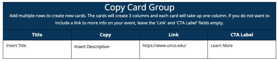
Copy Card Group
The copy card group snippet allows you to create a 3 column grid of cards that can
include a title, a short description, and a link. The grid column count is not configurable,
so be sure that you want at least 3 cards when using this snippet.
To use this snippet, select it from the Snippets dropdown to input the default table.
From here, you can insert a title, any desired copy, a link you would like to link
to, and a call-to-action table for your link. If you remove the link entirely or leave
it defaulted to https://www.unco.edu/, the card will be created with only text and without a link.
To add or remove cards, click into the table and find the Table toolbar. Each row
in the table creates a single card, and you can use the table's toolbar to add or
remove rows. Hover over each of the buttons within the table toolbar to display a
tooltip of what action that button will perform.
Insert Title
Insert Description
Contact Card
The contact card allows you to create a floating card of contact information. This
snippet works best with 1, 2 or 3 colmns worth of content and no more.
To use this snippet, select it from the Snippets dropdown to input the default table.
From here, you can add an icon for visual representation, a label for the info you're
adding, any text or copy you would like to add, and the link that you would like to
hyperlink that entire section to.
To add or remove rows from the table, click into the table and find the Table toolbar. Each row in the table creates a single column of content, and you can use the table's toolbar to add or remove rows. Hover over each of the buttons within the table toolbar to display a tooltip of what action that button will perform.
Questions? Get In Touch!
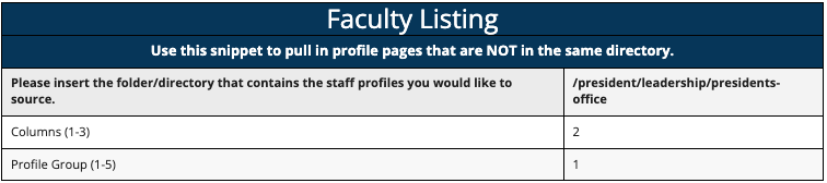
Dynamic Faculty Listing
The dynamic faculty listing works in much the same way normal faculty pages work,
the only exception is that the dynamic listing can pull staff members from anywhere
across the site even if those staff members are not housed within the same directory
as the page you are using the snippet on.
To use this snippet, select it from the Snippets dropdown to input the default table.
From here, the snippet works primarily the same as the normal faculty profile listing:
input how many columns you want your group to have, and input the profile group number
of the staff members you want. The unique piece of the snippet is the first row. By
entering the path to the folder where your staff member's files live, you can dynamically
call them using this snippet no matter where you are using it.


Full Width Statistics
The Full Width Statistics snippet allows you to create a section of up to 4 large
displayable data points or statistics.
To use this snippet, select it from the Snippets dropdown to input the default table.
From here, the first two rows will control the number of columns created and the color
they will display. You can have up to 4 statistics displayed or as few as 1, and changing
the value in the first row will appropriately adjust the number of columns displayed.
The second row will change the color of the statistics based on whether you’re placing
them against a light or dark background. In this example, they are against a white
background, so the value is ‘light’. If these were displayed against a dark background
such as navy, we would change this value to ‘dark’ so that all text is changed to
white to be visible against the dark background color.
The following rows after the settings each create their own statistic. You can place
whatever data point you want to display in the left hand column, and any accompanying
copy into the right hand column.
To add or remove rows from the table, click into the table and find the Table toolbar.
Each row in the table creates a single column of content, and you can use the table’s
toolbar to add or remove rows. Hover over each of the buttons within the table toolbar
to display a tooltip of what action that button will perform.
42%of Unc students are first in their families to attend college
1:10of Unc students are first in their families to attend college
100%of Unc students are first in their families to attend college
$58Kof Unc students are first in their families to attend college
Variable Grid
The Variable Grid snippet allows you to create a grid of up to 12 wrapping columns.
This snippet helps users have more control over the specific layout they are trying
to achieve.
To use this snippet, select it from the Snippets dropdown to input the default table.
From here, simply select the number of columns you would like in this section. Each
row beneath the count-setting will be placed into a single column in the row. If the
number of table-rows would exceed the number of columns you have selected, the columns
will wrap into a new row as necessary. For example, if you have selected 2 columns,
but you have added 4 rows worth of contents into this snippet-table, the snippet will
create 2 rows of 2 columns for your content, where your first two columns will fall
into the first row, and the final two columns would be placed into a secondary row
beneath the first.
To add or remove rows from the table, click into the table and find the Table toolbar.
Each row in the table creates a single column of content, and you can use the table’s
toolbar to add or remove rows. Hover over each of the buttons within the table toolbar
to display a tooltip of what action that button will perform.
One Vivamus sagittis lacus vel augue laoreet rutrum faucibus dolor auctor. Duis mollis, est non commodo luctus, nisi erat porttitor ligula, eget lacinia odio sem nec elit. Curabitur blandit tempus porttitor.
One Vivamus sagittis lacus vel augue laoreet rutrum faucibus dolor auctor. Duis mollis, est non commodo luctus, nisi erat porttitor ligula, eget lacinia odio sem nec elit. Curabitur blandit tempus porttitor.
One Vivamus sagittis lacus vel augue laoreet rutrum faucibus dolor auctor. Duis mollis, est non commodo luctus, nisi erat porttitor ligula, eget lacinia odio sem nec elit. Curabitur blandit tempus porttitor.
One Vivamus sagittis lacus vel augue laoreet rutrum faucibus dolor auctor. Duis mollis, est non commodo luctus, nisi erat porttitor ligula, eget lacinia odio sem nec elit. Curabitur blandit tempus porttitor.
Slate Form Embed
The Slate Form Embed snippet allows you to embed a Slate Form onto your page. Remember,
this embed only accepts SLATE forms, so if you form has been built using any other
technology besides Slate, this snippet cannot be used.
To use this snippet, select it from the Snippets dropdown to input the default table.
From here, in the first row, you can adjust both the title and copy that will appear
above the form. Beneath the form URL, insert the URL that you took from Slate. From
the backend of the form on Slate, you should see the URL field in the first few lines
of information at the top of the page.
Request Information
Would you like to receive information about a program?Title Overlay Cards
The Title Overlay Card snippet allows you to create one or more cards that contain
a title, supporting image, body copy and hyperlink.
To use this snippet, select it from the Snippets dropdown to input the default table.
From here, in the first row, you can determine the number of columns you want your
cards to fall into. This can be updated at any time. Each row beneath that will create
a single card in the group. For each card, insert your title, supporting image, any
copy that you would like to accompany the card, and a hyperlink to link the title
and image to.
To add or remove rows from the table, click into the table and find the Table toolbar.
Each row in the table creates a single column of content, and you can use the table’s
toolbar to add or remove rows. Hover over each of the buttons within the table toolbar
to display a tooltip of what action that button will perform.