Page Banners
Page banners are great when they're used properly, but when they're misused...not so great. Good news! You don't HAVE to have a page with a page banner region turned on. In fact, it's recommended that the index page have a banner image. For inside pages, banner images aren't necessary.
The website has approximately 30,000 pages, which means there are a lot of images to find to put on the top of every page. Sometimes, it's not necessary and pushes your content further down the page. Other reasons not to use a page banner: faster page load times, ability to put images further down throughout the page; and, on mobile, keeping information closer to the top of your page, which requires less scrolling.

You can download a header template for Photoshop to size your images if you'd like. Be sure to turn off the top layer with the size specifications before you save the file for web.
Page Banner Options:
No Banner Image: In your page properties simply set the Page Banner to "Off" and you'll have a page banner area as shown above.
Banner Image, Static: In your page properties simply turn your Page Banner to "On," edit the section, and place a new single picture.
Banner Images, Slider: In your page properties simply turn your Page Banner to "On," edit the section, and place in a new image, hit return and then place a second and third image.
Page Banner Customizable Fields:
Site Title: When you make your site, you will have the site title automatically populate as the biggest heading.
Page Title: When you make your page, it will automatically populate that in all caps below the site title.
Page Description: This is optional--and encouraged. Describe to the viewer-- in a sentence or two with a limit of 190 characters--what this particular page is about.
Page Banner Photography Tips
Image Size: Crop your image AND save for the web to reduce file load time: 1600x440 pixels, 72 dpi, RGB.
Pick a Focus: Choose a striking and simple image to convey your page content. You don't have to be literal in your photography usage. Tighter cropping and a focused subject matter will create better images. Using focused images provides a sense of intimacy and fosters that "picture yourself here" look. The page banner also has a blue rectangle with the page information always on the left, so most of the time, content focus should be on the right. See the example below of focused and non-focused.
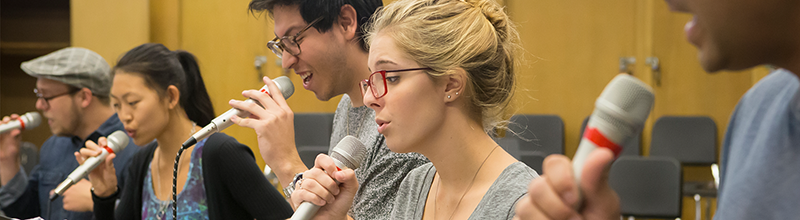
In this example, the picture is nice, but there are a lot of people in focus.
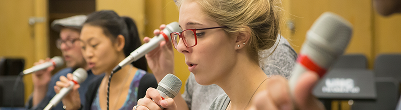
In this example, you're picking where the viewer will look and putting them in the moment. Think of these images like billboards: most effective as quick reads.
Page Banner Best Practices
Text in Banner Images: No text should be superimposed on images unless it is done through the page properties. That means no quotes, special announcements or captions. If you need a caption for your photo, pull others that are similar and do a gallery or content slider farther down the page. These images are wallpaper, a billboard. A quick glance, not to be engaged with.
Logos in Banner Images: No logo is to be used in the header images. If you have a logo it would be best used farther down in the page either in the sidebar or as an art element on the page. Every page will have the UNC logo on the top of it, so putting an image in the banner image area, will be competing and not be pleasing to the eye.
Multiple Images on One Banner Image: The answer here is not to do it. If you have more than one topic/department to show, feel free to use the image slider. And if you have to put them in order, do it alphabetically to prevent any favoritism.
Banner Slideshows: Research shows that slideshows are ineffective uses of banner space. Rather than displaying five banners, consider coming in weekly or monthly to change out the image. That not only allows you to cycle through your content, but also freshens your site on a regular basis.
Banner Slideshow Theme: While using multiple banner images in a slideshow, try to tie them together around a single theme or idea. For example, images of different types of research that speak to our outstanding faculty, high-performing students that speak to our academic excellence, outstanding alumni or a series of images that speak to your unique selling proposition.